
Responsive Tabs
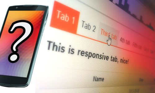
If you have a component with tabs in your non-mobile website you don’t think about “how will those look on smaller screens?” You already know it’s going to look ok but switching between tabs will not feel comfy in most cases. Instead you should wonder “how do I make it work well on mobile?” or “how to make tabs usable on smaller screens?“. Creating responsive tabs is important to make the website usable in every environment.
“Tabs”, how-to
Depending on a number of tabs in your component, making it look and work just like in desktop may not always be the best idea. You can make tabs a little bigger to make them easier to hit with your fingers. Sure, that’ll work on a component with 2 or 3 tabs (with small, non-descriptive captions on them). What if your component have more then 3 tabs or even better - dynamic number of tabs? Predicting the numbers and making silly styling adjustments for each of them is like ignoring a huge hole in your room and stepping over it, every time you want to get out. :D The perfect solution doesn’t need to be a hard one if you start thinking in Responsive Web Design and It doesn’t require any bloated jQuery plugin. While we’re still going to use a little bit of jQuery, It will only be used to switch between CSS classes.
Mobile and desktop, two different views?
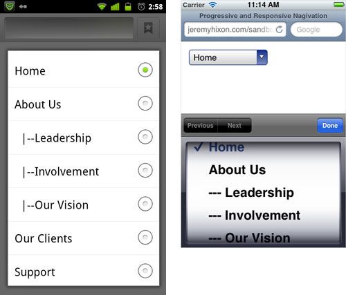
Do I need to create two different views for small and big screens? No!… well, JS will take care of it but no worries - It’ll not duplicate the content of your tabs, only the “tab-switching mechanism” itself. As I said earlier, tapping between tabs, which are placed in more then a few lines, may not be comfortable. For mobile we can and should use HTML option and select tags. Using those tags on mobile browsers is really convenient, the selection pop-up takes up big chunk of the screen so you can easily swipe it through and tap your preference. Obviously this solution alone will not be that usable on desktop. We’ll use CSS media queries to show either option element for small screens or casual tabs for desktops.
Preparations, HTML
First things first, so here’s the code for one component with multiple tabs. This chunk of HTML might look different from the other tabs JS libraries. We don’t have to define tab handles - JavaScript will handle it.
<div class="tabs">
	<div class="tab" data-name="Tab 1 Title">Content 1</div>
	<div class="tab" data-name="Tab 2 Title">Content 2</div>
	<!-- and so on -->
</div>
Okay, stop for a moment. Now you might think: This won’t be usable for those with JavaScript turned off! What about the Mobile First? I am not one of those who believe that a lot of people turn off their JavaScript (I know there are other situations why this is important: business proxies, slow bandwidth hick-ups…, I’m not a total ignorant :) ), but if You are - fret not! I got you covered! See the construction of HTML above? One DIV element under the other and no interactive elements will be generated. User will be presented with casual, long webpage. You could easily add headers inside each tabs content and bottom borders for every tab to make it more readable. Problem solved!
Interaction
The code would do 2 things:
- Catch all .tabs and inject interaction
- Listen to field change or click events and switch tabs
The first function I’ve written is showTab(). It gets 2 arguments, both numbers. tabs is an index of tabs group and tab is an index of particular tab we want to make visible. This function simply toggles tabs between .active and .hidden classes. I could choose to just set active class and make all non-active elements hidden but that would be problematic for those without JS.
function showTab(tabs, tab) {
	// hide currently visible tab
	$('.tabs').eq(tabs).find('.tab.active').removeClass('active').addClass('hidden');
	// change current tabs handle to normal state
	$('.tabs').eq(tabs).find('.tabs-trig.active').removeClass('active');

	// show the new tab
	$('.tabs').eq(tabs).find('.tab').eq(tab).removeClass('hidden').addClass('active');

	// and make the tab's handle stand out
	$('.tabs').eq(tabs).find('.tabs-trig').eq(tab).addClass('active');
}
Now for more interesting stuff. Second function js«initTabs() generates tab handles and select field with option elements for every .tabs component it can find on the page. Handles are contained within a div.hidden-small element and select field is in div.visible-small. We’re going to use those classes later to show one controller or the other, depending on the screen size.
function initTabs() {
	// Find every tabs on page and…
	$('.tabs').each(function (i) {
		var tabs = $(this),
			head = $('<div>'),
			handles = $('<div>'),
			select = $('');

		// assign an ID, so we can access it later
		tabs.attr('id', 'tabs' + i);

		// for each tab - generate handles and select fields
		tabs.find('.tab').each(function (j) {
			handles.append($('<a href="#">' + $(this).data('name') + '</a>'));
			select.append('' + $(this).data('name') + '');
		});

		// Add elements to the view
		head.append(handles);
		tabs.prepend(head);
		tabs.prepend(select);
		// Start listening for interaction
		tabs.find('.tabs-trig').each(function (j) {
			$(this).click(function (e) {
				e.preventDefault();
				showTab(i, j);
			});
		});
		select.change(function () {
			var target = $(this).find('option:selected').attr('value');
			showTab(i, parseInt(target.substr(3)));
		});

		// Pick and show the first tab
		tabs.find('.tabs-trig').eq(0).addClass('active');
		tabs.find('.tab').addClass('hidden');
		tabs.find('.tab').eq(0).removeClass('hidden').addClass('active');
	});
}
CSS styles
I’m not going to type the whole CSS here, just that one most important thing - media query. Using that query we can “program” browser to hide or show elements under chosen conditions. In our case that will be a screen size.
/* defaults */
.hidden-small {
	display: block;
}
.visible-small {
	display: none;
}

/*
 * what happens if screen width is
 * SMALLER or equal to 767 pixels
 */
@media (max-width: 767px) {
	.hidden-small {
		display: none;
	}
	.visible-small {
		display: block;
	}
}
Result
You might check out the result directly on Codepen, the widget below will never be bigger than 767px so you won’t be able to see “the big screen” tabs.
More to read
- Progressive And Responsive Navigation - Smashing Magazine