
Android text field using HTML and CSS
This post is about re-creating text fields as seen in Android 4. Not the newest, but the trick still applies and may be used in many other ways.

If you’re making android-exclusive mobile website (or HTML5 mobile app), you might want to make it look and feel as native as possible. Today I’m going to show you how to create text fields known from Android JellyBean - using only HTML and CSS.
The Android text field has full border on bottom side and partial borders on left and right sides. “Partial” borders are not (yet?) possible to achieve using standard CSS properties. We can use two small pseudo-elements to draw it - :before will be used to render left border and :after for the right side. One could think that simply adding pseudo-elements to the html«<input> field would be enough. It’s not going to be THAT easy. After some searching I’ve found a question about applying :after element on input field. tl;dr - not possible:
Pseudo elements can only be defined (or better said are only supported) on container elements. Because the way they are rendered are within the container itself as a DOM element.
html«<input>can not contain other elements hence they’re not supported. Ahtml«<button>on the other hand that’s also a form element supports them, because it’s a container of other sub elements.
BUT there are other ways to do what we want! In our example we still can use additional html«<div> tag and apply pseudo-elements to it. So…
Let’s give it a try
Here’s 1:1 screenshot from native SMS app, I’m going to use it as a reference:

“Wpisz wiadomość” stands for “Type your message” :D
The color of borders look like a darker version of blue. You can get hex codes of main colors used in android interface on Android Color styleguide. I’m picking #0099CC. These are the basic elements for our text field.
<div class="jelly-form" style="width:356px">
	<input type="text" placeholder="Type your message" />
</div>
Width for html«<div> tag is set only to match the reference text field. It can be set to any other size, even 100%. html«<div> is here to limit the size of inner html«<input> (which size is always 100%, it fully fills the div) and to define position of left and right borders.
Now, for the CSS. First, let’s get rid of standard borders and set the bottom border, just for the starters.
.jelly-form input[type='text'] {
	border-top: none;
	border-left: none;
	border-right: none;
	border-bottom: 2px solid #0099cc;

	box-sizing: border-box;
	outline: none;

	font-size: 1.4em;
	padding: 0.6em 0.6em;
	width: 100%;
}
We’re applying both width and padding of the html«<input>, so to save us some headache with proper positioning later, we’re just going to set box-sizing to border-box. Setting bigger font-size and some padding will make our text field finger-friendly. Using css«outline: none; will also remove standard outline of form element when in focus. Outlines look different in every browser, for example Chrome both on android and desktop have yellow-ish outline.
Now let’s take a look at left and right borders.
.jelly-form {
	position: relative;
}
.jelly-form:before,
.jelly-form:after {
	content: '';
	display: block;

	position: absolute;
	bottom: 2px;

	height: 6px;
	border-left: 2px solid #0099cc;
}
.jelly-form:before {
	left: 0;
}
.jelly-form:after {
	right: 0;
}
We’re using absolute positioning of pseudo-elements to push them to left and right boundaries of outer element. Without css«position: relative; of the outer element, those borders would float out to the browser’s boundaries, which in our case isn’t good. To make :before and :after visible, we need to set its content. And because we’re only using them for their borders, we can set it to '' (empty content). Without that property, we would see nothing.
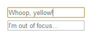
Result
Sweet, everything is set-up! Here’s the final result with all the code:
See the Pen Hkqfp by Darek Zieliński (@Zielak) on CodePen.
Support
border-box is supported on almost every desktop browser (not talking about old IE), so this component will look good in most cases. Remember that we’re coding it exclusively for Android. If you’re eager to use it for desktop browsers - be sure to apply css«-moz-box-sizing: border-box; too for Firefox support. I have only tested the result in JB 4.1.1, 4.2.2 stock browser and also on Chrome Beta. It would be nice if someone could post their own tests on other devices :)
The End
I hope someone will find this article useful. If there are any typos, linguistic mistakes let me know in the comments. Also let me know if there is anything that could be improved in code, I like to learn new stuff!