
Scrollable off-canvas navigation in HTML mobile app
This article mentions old versions of Android and Zepto library. But other than that, some tricks may still be usable today.
There are many different ways to achieve nice and fluid off-canvas navigation in mobile websites. Some simple solutions can be easily implemented in you mobile app without too much of a trouble. The problem comes when we want to create menu similar to those in native apps, like Google+ or new Gmail app. We start to design it on the computers, we put some JS and CSS definitions - everything works fine! By the time we open our app on the phone we realise that something is not quite right… and it gets even worse on other or older devices.
Imitate native app’s navigation in HTML
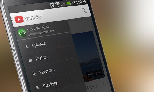
On the new YouTube app, we have a combination of a fixed header and off-canvas menu. When we pull out menu, the rest of the containers stays on place. We can easily swipe through the list in menu and swipe it off to hide it.
I wanted to create similar menu, which slides in from left side of the screen when I tap a logo and hide it when I tap it again.
It’s not very simple
We could use jQuery for the animation and depend on one simple click event listener, sure, it’ll do the job - but not the right way. Firstly, It already is a common knowledge that jQuery animations aren’t as fast and sleek as CSS3 animations. To make things even smoother we’re going to use CSS3 combination of translate3d() for setting A and B positions of the menu and transition for animating It. Using translate3d() function in our CSS file will also turn on hardware-acceleration trickery on the browser providing even smoother transitions. If you are concerned about compatibility you could always try animating left property instead (which I will cover later in this article), but keep in mind that It won’t be hardware-accelerated.
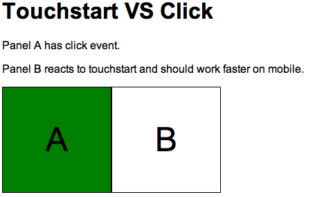
Secondly, click event doesn’t work as fast on mobile as on desktop - there is always ~300ms delay between the touch of our fingers and when the event is invoked. The browser is actually waiting to see it we’re trying to do a double-tap. Our app should be quick and responsive, so we’re going to use touchstart event instead. Below is a link to my test page showing difference between both click and touchstart events, be sure to try it out on mobile device. There is QR code inside.
Lastly, the “scrollable” part. In this menu we’re going to use a combination of fixed elements with overflow scroll property, which is not very well supported on older Android devices. So as a fallback mechanism we can adopt nice iScroll script from cubiq.org and run it only when the browser says It’s old.
Turn theory to practise
Starting with HTML structure
<html>
  <head>
    <meta
      name="viewport"
      content="width=device-width, height=device-height, initial-scale=1, maximum-scale=1, user-scalable=no"
    />
  </head>
  <body>
    <div id="nav-menu" class="nav-menu">
      <div>1 One</div>
      <div>2 Two</div>
      <div>3 Three</div>
      <!-- And so on -->
    </div>

    <div class="header">
      <div class="menu-btn">MENU</div>
    </div>

    <div class="wrapper">Yadda, yadda.</div>
  </body>
</html>
Explanation
Line 3 - setting meta viewport properties will make the page suitable for mobile devices. It locks maximum page size to device’s size and disables the possibility to zoom in with double-tap.
.nav-menu - I’ve used simple html«<div>s as menu list elements because when I tried html«<li>, they were changing heights while the whole animation was playing. If you’re concerned about SEO feel free to use proper navigation elements.
.header - is always visible and fixed to the top. It contains only “MENU” button, but you can play around and also add a search bar.
.wrapper - actual contents of our page: text, images and what-not.
Style it up
body {
  margin: 0;
  font-family: arial;
}
div {
  box-sizing: border-box;
}
.header {
  position: fixed;
  left: 0;
  right: 0;
  top: 0;
  height: 45px;

  background: #e0e0e0;
}
.menu-btn {
  font-weight: bold;
  padding: 10px;
}
.nav-menu {
  position: fixed;
  top: 45px;
  bottom: 0;
  width: 85%;

  overflow-y: hidden;
  overflow-x: hidden;

  background: #333;

  transform: translate3d(-100%, 0, 0);

  /* easeOutCubic */
  transition: transform 0.25s cubic-bezier(0.215, 0.61, 0.355, 1);
}
.menu-open .nav-menu {
  overflow-y: scroll;

  transform: translate3d(0, 0, 0);
}
.nav-menu div {
  padding: 10px;

  border-bottom: 1px solid #666;
  background: #333;
  color: #fff;
}
.wrapper {
  padding: 45px 1em 1em 1em;
}
Explanation
div - box-sizing is useful when dealing with containers that have inner padding. When we set our element’s css«width: 200px;, it will alwasy be 200 pixels wide, irrespective of the inner padding.
.header - as mentioned before, our header will be always glued to the top. Note that we’re setting the height here. It’s going to be css«.wrapper’s top margin too, so the header won’t overlap the content (not even by a tiny pixel).
.nav-menu - here’s where the fun part begins. Menu should take 85% of the screen’s width when opened and displayed right below the header (hence the same 45px). The whole element is pushed outside the view thanks to line 32 (setting x position to -100%). translate3D() is also used to force hardware acceleration for our page, which will make animations a bit smoother. transition property contains custom-made easing function. Ceaser is a nice tool I used for creating specific cubic-bezier CSS functions. In the line 38 there are definitions for the opened menu. Class css«.menu-open will be attached to and removed from html«<body> element every time the user taps menu button.
.nav-menu div - defines all menu items.
.wrapper - here we see again those 45px. Just like with the menu, we can’t display our content hidden under the header.
JavaScript Interaction
We’re almost there, the last thing to do is glue it all together with JS.
Variables
var webKitVersion = parseInt(
  navigator.userAgent.substr(navigator.userAgent.search('AppleWebKit/') + 12, 3)
);
var menuOpen = false;
var navMenuScroll;
Variable name webKitVersion pretty speaks for itself, WebKit version is extracted from the user-agent. Then the script holds state of the menu in menuOpen and navMenuScroll will be used for the iScroll helper in case of older browsers.
Animation
Zepto(function ($) {
  loadCssPolyfill();

  $('.menu-btn')[0].addEventListener(
    'touchstart',
    function (event) {
      $('body').toggleClass('menu-open');
      menuOpen = $('body').hasClass('menu-open') ? true : false;
    },
    false
  );
  $('.wrapper')[0].addEventListener(
    'touchstart',
    function (event) {
      if (menuOpen) {
        $('body').toggleClass('menu-open');
        menuOpen = $('body').hasClass('menu-open') ? true : false;
      }
    },
    false
  );
});
Line 1 - is a Zepto’s way of running script when page finished loading.
Line 2 - js«loadCssPolyfill() will be defined later, it will help us with scrolling list on older devices.
Line 6 - defines what happens when we touch menu button.
Line 14 - in case when we have menu opened we can always close it by touching content of the page, just like in Android native apps.
Scrolling for Android 2.*
function loadCssPolyfill() {
  // Shortcut, using POJO instead of Zepto/jQuery for ultra speed!
  var $ = document;

  // Provide fallback solution for Android 2.* devices with old WebKit
  if (webKitVersion <= 533) {
    // Get the styles on the fly
    if (!$.getElementById('android2')) {
      var head = $.getElementsByTagName('head')[0];
      var link = $.createElement('link');
      link.id = 'android2';
      link.rel = 'stylesheet';
      link.type = 'text/css';
      link.href = 'css/android2.css';
      link.media = 'all';
      head.appendChild(link);
    }

    // Use iScroll on .nav-menu
    navMenuScroll = new iScroll('nav-menu', {
      hScroll: false,
      hScrollbar: false,
      bounce: false,
      lockDirection: true,
      scrollbarClass: 'nav-menu-scrollbar',
    });
  }
}
As you can see, the script attaches new CSS file for Android 2.* devices. This file contains some fixes and also animation of the navigation using left property, because we already know that nice webkit transform3d() transitions wouldn’t work here.
Nicely done
This project is far from what you would want to show to the client. I’ve shown you just the basics so now It’s all up to you to beautify it!
Again, this Demo should also be viewed on your mobile device, not desktop! The menu does not respond to click events, so abusing it with your mouse won’t help :D . In case of any problems or questions feel free to put them in the comments below. I’d be more than happy to answer.

More to read
If you’re eager to pump more knowledge into your brain you can have a look at those articles:
- Lets play with hardware accelerated CSS - Smashing Magazine
- What WebKit version is in what Android version? - Jim Bergman